Blender Artist Notes #1: By the lakeside render
Posting this fresh off my mind. I just recently finished a Blender piece, that I’m about 90% satisfied with. I’m not really aiming for any higher right now because the piece is fine as it is right now and adding anymore without knowing what to add is going to ruin it.
In this post, I’m aiming to keep a record of the techniques I used, especially since this was the first time I achieved a somewhat satisfying largescale environment. There are a couple of things to write down for reference, in case I come back to it again or hopefully some other Blender beginner comes looking for tips.
This is the final render:
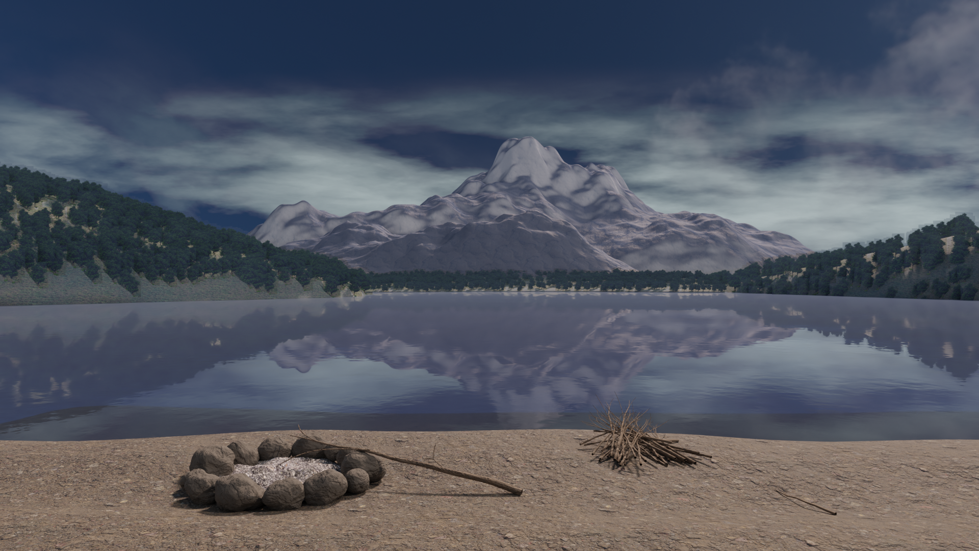
For more information and a look at the models and whatnot, check out the post on my ArtStation page, where I post my older renders as well (in hindsight, I probably should improve on them as well).
Note: this scene was done in Blender 2.92
The scene may seem complicated but it’s not in many ways. Initially, I manually modeled the mountain in the background to get a conical shape. Unfortunately, it was difficult to add the proper displacements to the mountain, such as ridges and rock faces, whether it be manually or with a displace modifier. This meant I ended up using the A.N.T Landscape addon available in Blender, which helped massively in creating somewhat convincing realistic mountain shapes. Other addons I used were the Sapling Tree Gen for the branches on the beach, and the Import Images as Planes for the trees used as hair particles on the landscape.
Sense of scale: camera and perspective
The first thing I should mention is achieving a sense of scale appropriate for the mountain range in the background. I could actually try to model them to scale but that brings many problems with it.
For one, it is impossibly hard to model if we try a 1:1 scale in Blender (especially with viewport clipping) and navigating around while organizing the assets becomes unwieldy.
Even with the scale I did in this render, moving things around with 100 times differences in scales was already hard.
For reference, the mountain in the background is 650m wide whereas the campfire stones were about 3m each according to Blender.
A useful trick that I used here was adjusting the focal length of the (virtual) camera. For those who are unfamiliar with cameras, focal length generally controls the zoom distance objects are to the camera. A “side effect”, if it can be called that, is that the angle of view also changes when the focal length is changed, affecting the perspective from the viewport. Increasing focal length decreases the angle of view so fewer objects are in frame around the subject, whereas decreasing the focal length (as I did in this case) increases the angle of view, showing more of the surroundings and pushing faraway objects even further back.
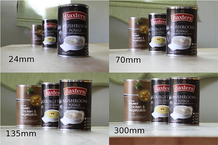
In this scene, from the Blender default of a 50mm focal length, the camera uses a 23mm focal length. The number isn’t anything specific, rather an arbitrary figure I found to best fit this scene and its layout.
Properly using PBR textures
Well, this is gonna be quite a short one but I’ve done it “wrong”, or at least improperly, for a while now. I also just learned how drastic a change just adding a bump map makes (coming from previously using only the albedo and normal maps).
There’s also the matter of mapping the texture for when you scale the model into a weird shape. As a UV unwrapping amateur, I’ve found that it helps a lot to try properly mapping the textures, so here’s a somewhat complete example of how I do it:
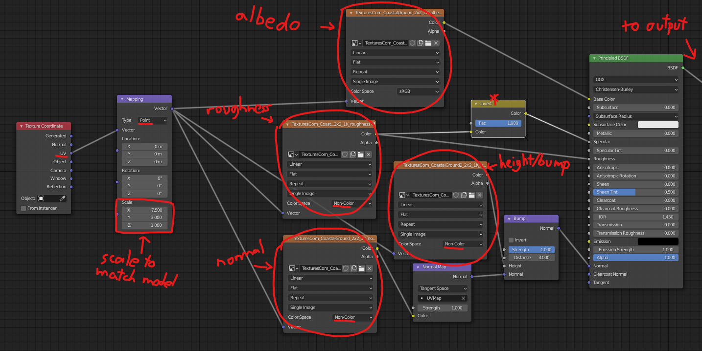
I starred the input to the specular because I found that doing the invert of the roughness map doesn’t actually make a significant difference (or even do anything in reality). I’ve mostly kept it around for peace of mind. Changes to specular are generally not noticeable anyways, when using all the other textures properly.
Scaling the texture can require a considerable amount of adjustment as well. First, the scaling has to match the original texture, such that the texture isn’t stretched in any direction (or enough so that it’s unnoticeable). Then second is to scale the textures enough to prevent tiling. A scale that is too large will either create very noticeable tiles on the surface, even from a distance, or the details of the texture will be lost. On the other hand, a scale too small makes it so that the texture is pixelated, especially if it is not a 4K or 8K texture.
Adding some fog
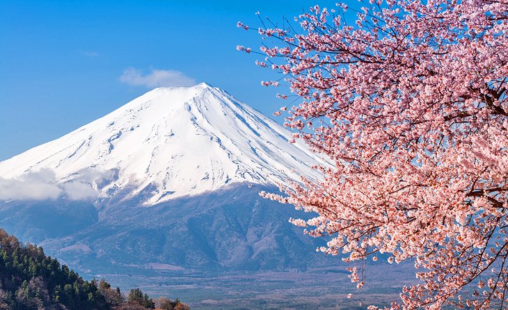
This was a rather tricky one. I was looking through a number of photos of mountains, mainly of Mount Fuji (which I based this image on initially) and the one thing that is quite noticeable is the “mist” or fog effect on the mountain when it is far enough in the background. What I mean by this is how the colors of the mountain and the land far away from the camera is much less saturated and sort of “veiled” compared to elements in the foreground. To me, it seemed to add a sense of depth, and this was the effect I sought to recreate.
For this effect, I had to go through 3 different methods before finding the one that worked best. I’ll detail them here as well.
I initially tried using the built-in mist pass in Blender, enabled by going to View Layer Properties -> Passes -> Data -> Mist and adjusted under World -> Mist Pass. Then the mist pass would have to be mixed with the final render using the Blender compositor: more details here It didn’t really work especially due to how aggressive the mist pass was and the blue in the sky was entirely lost. It seemed to me like it would work best in an indoor scene or a scene where the sky was not visible at all. Alternatively, one could also use the Z-depth pass to give similar effects to the mist pass, but neither of them worked in this situation for me.
The second option I then tried was to use volumetric lighting. There are two ways to achieve this. The first method is to add volumetric scattering to the world environment, by going to World -> Volume and change it to Volume Scatter. It works at a very low density value, like 0.001; otherwise, you get a very white screen. This method entirely removes the effect of any world textures, like HDRs, so I couldn’t use it. The second method is by adding a massive cube over the terrain and setting its material to Volume -> Volume Scatter. Again, it only works for very low values of density. From my observations, this method works best for indoor scenes, where you want to achieve the god rays and a heavy atmosphere, and works well for night scenes as well. When I used it for an outdoor daytime scene, the fact that the cube didn’t have a surface material meant that the surface opposite the camera was not rendered, resulting in a weird brighter rectangle in the middle of the scene. In addition, volume scattering is very computationally intensive and renders take considerably longer - not fit for a quick preview in the viewport.
In the end, I came back to working with the material shaders. The node group below calculates how much “fog” to add to the object based on the ray length from the camera (or last bounce, according to Blender’s documentation). Then, it mixes the fog shader with the current shader the object has to achieve the depth effect.
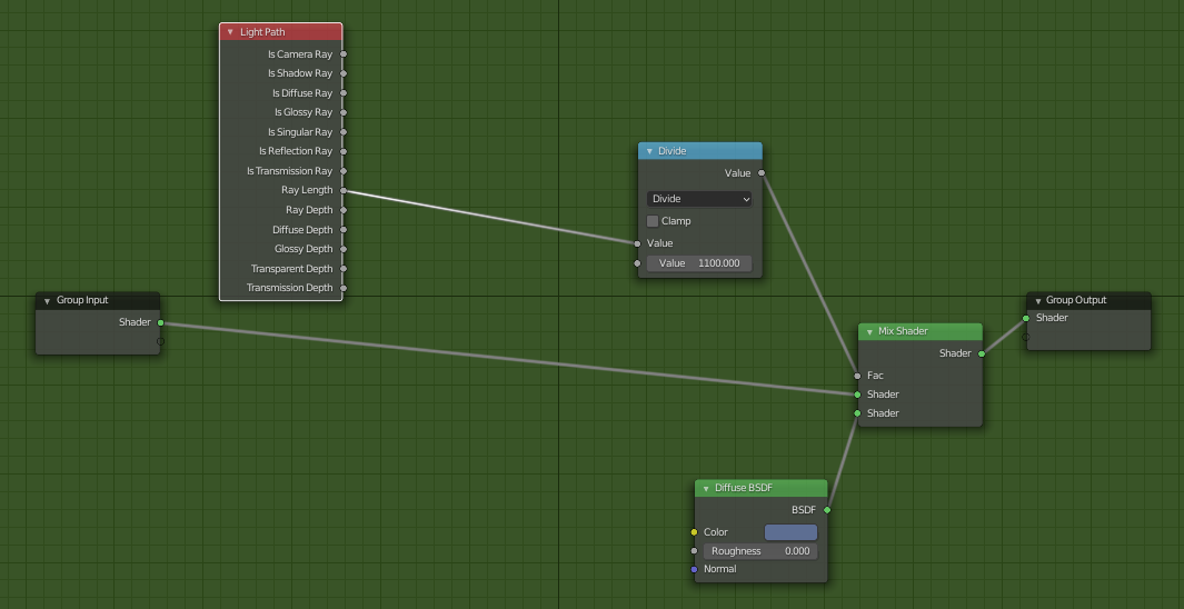
It is handy to keep this in a node group because this shader has to be added to every element in the scene (or at least every element that is at some distance away). The color of the diffuse shader is the shade you want the additive fog to be in, which in my case was a similar tint to the sky. The other significant number to note is the divisor in the Divide node. A lower number increases the amount of “fog” on the object. Due to the size and distance from the camera the objects in this scene are, the divisor is correspondingly large.
As a closing note, I think there are probably a few things I would have to improve on. The mountain in the background still could look better, though how I’m not entirely sure. The beach could also use some slight adjustments, maybe adding a few footprints or some trails would help. Also I know I could improve the lands surrounding the lake but I’m feeling quite uninspired and not entirely sure what to add to spice it up. A chalet of some sort could do but the details would be entirely lost as a backgroud object.
I do know what I want to try on Blender next though. Dynamic painting. That could’ve definitely been handy in making those footprints, but they take such a long time to set up. Need to find a foolproof way for it, simple enough for me to remember as well. And maybe matte painting when I get ahold of a drawing tablet of some sort. Then I could finally put to use the (way too many) ideas Yuru Camp gives me. If I don’t end up going camping before then, that is.
